Corporate identity: what it includes and how to build it
A logo is only the beginning. Here is what a corporate identity includes, how it differs from a brand, why you need a brand book and the steps to build one the right way.
What is a corporate identity?
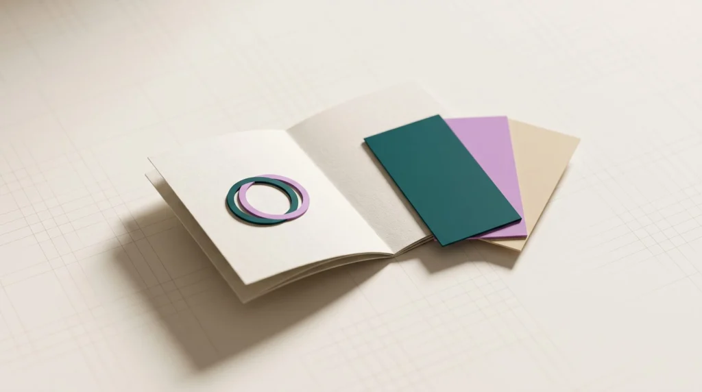
A corporate identity is the set of elements that make your business recognizable: logo, colors, typefaces, imagery and tone of voice. These are the tools you control, and they show up everywhere, from your site and social media to your business card, packaging and signage.
A good identity does two things. It sets you apart from the competition and it builds trust, because customers see the same, consistent image wherever they meet you.
What it includes
A complete corporate identity usually has:
- Logo and variations: horizontal, vertical, symbol only, a single-color version and a favicon for your site.
- Colors: primary and secondary, with codes for screen (HEX, RGB) and for print (CMYK, Pantone).
- Typefaces: for headings and body text, licensed for use and with full Greek character support if you communicate in Greek.
- Imagery and icons: a recognizable style of photography or illustration.
- Tone of voice: how the business speaks, e.g. more formal or more friendly.
- Applications: business cards, email signatures, social media templates, presentations and signage.
All of these work together. A great logo with random colors and typefaces in every post doesn’t build recognition. Consistency is what makes customers recognize you before they even read your name.
Identity, brand and rebranding: what’s the difference?
These three are often confused. Your brand is what people think and feel about your business. Your identity is the set of tools you use to shape that. Rebranding is changing them, a little or a lot, when the business has changed and its image no longer reflects it.
Put simply: an identity is designed, a brand is earned, and rebranding happens when the two no longer match.
The brand book and why you need it
A brand book (or brand guidelines) is the document with the rules: how the logo is used and how it isn’t, which colors and typefaces, what spacing, what style the images and texts have.
Without one, every new partner, designer or printer interprets your identity in their own way, and within a year your brand has five versions. Today a brand book also needs rules for AI-generated images, so they look like yours too.
A practical brand book doesn’t need to be 80 pages long. It needs to quickly answer the questions anyone working with your brand will ask: which logo file to use, on which background, with which colors. And it should be easy to find, e.g. as a shared PDF or an online page, together with all the files.
How it is built, step by step
A good corporate identity doesn’t start with the logo. It starts with what the business is:
- Analysis: market, competitors, audience and the company’s values.
- Strategy: what you want customers to think when they see you, and what makes you different.
- Creative direction: moodboards and first ideas, before anything final is designed.
- Design: logo, colors, typefaces and imagery as one system.
- Testing: how it looks on a phone, at small sizes, in black and white, in print.
- Handover: the brand book and all files in the right formats for web and print.
How long it takes
There is no fixed timeframe. It depends on the size of the business, on whether you also need a new name (naming) or in-depth research, and on how many applications the identity has to cover: website, packaging, signage, print.
Most of the time doesn’t go into design, but into analysis and decisions. The more clearly you know what you want your identity to say, the faster it comes together.
To keep things moving, prepare in advance: who your main customers are, who your competitors are, three brands you like (and why) and who makes the final decision in your business.
The mistakes we see most often
When we review an existing identity, the problems are usually the same:
- A logo that can’t be read at small sizes, e.g. as a favicon or a social media profile picture.
- Different colors on every channel, because no codes were ever defined.
- Typefaces without Greek characters or without a license for commercial use.
- Colors with such low contrast that text is hard to read.
- A logo delivered only as an image (JPG or PNG), with no vector file (SVG, PDF or AI) for print and signage.
- A design that follows this year’s trend and ages very quickly.
Corporate identity FAQ
Are a logo and a corporate identity the same thing?
No. The logo is just one part of the identity. Without colors, typefaces and rules around it, every application will look different.
Does a small business need a corporate identity?
Yes, perhaps even more than a large one. A small business has fewer chances to stick in a customer’s mind, so every touchpoint needs to be recognizable.
How often should a corporate identity change?
A good identity lasts for many years. Small refreshes, e.g. a simpler logo for mobile screens, are normal. A complete change is only needed when the business itself changes fundamentally.
A corporate identity isn’t decoration. It is how people remember you. At CNCTECH we design corporate identities from analysis to brand book, with rules that keep your brand consistent from your website to your business card.